Confusing Branding terms explained
By 3cs Member, Helen Bell:
It has been brought to my attention, that not everyone knows everything about branding!
Those of us that do know a bit about the lingo may still be unsure about what it actually means when you hear certain words. So I’m going to take you through my most used branding design terms. This will help you seem super clever and knowledgeable next time someone like me is talking non stop about logos!
I’ve tried to work through the definitions in a logical way because obviously doing it alphabetically would have been way too easy
Ok let’s leap in...
Brand identity
The collection of visual elements that make your brand identifiable. Usually broken down into logo, fonts, colours, imagery and tone of voice.
Logo
A recognisable mark or symbol that is used to identify a business.
A logo can be used with:
Tagline
A line of text that is used to clarify the business message
Wordmark
A stylised version of the business’ name.
Lock up
A combination of the logo, tagline and wordmark specifically designed to be used together.

Fonts / Typefaces
The fonts you use when displaying written copy for your business. There are usually at least two recommended fonts for a brand.
Headline font
A distinctive font that uses your brand personality to get your main messages across
Body font
A complimentary font that is easily readable at small sizes for large amount of text.
Together these two fonts work hard to put a cohesive appearance to your brand.
Display font
This third font is used purely for large important headers. It should be used in small quantities and when impact is needed. It should complement the other two fonts.

Colour palettes
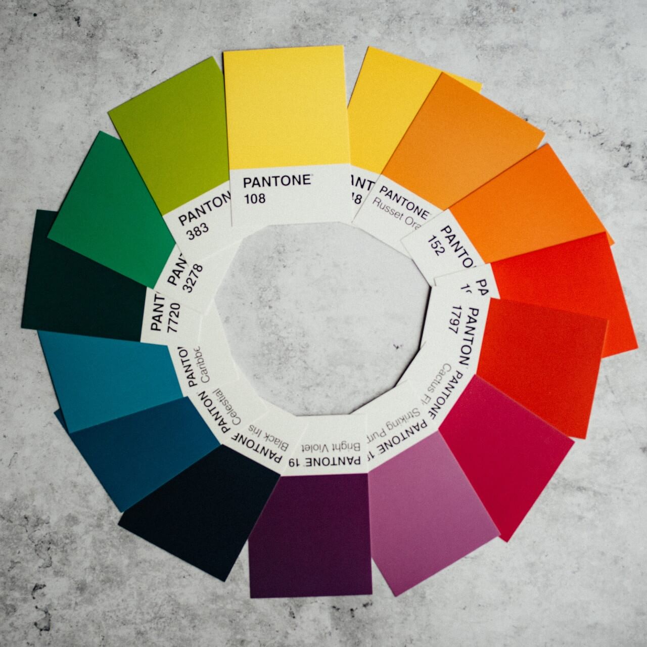
This is arguably the most defining part of your branding. The colours you chose will give an instant impression of your business. As an easy start, palettes should include 3 colours: a base, an accent and a neutral. The colours you pick can be:
Complementary colours
Your base and accent colours are taken from opposite sides of the colour wheel. Eg blue and orange; red and green; yellow and purple.
Harmonious colours
Your base and accent colours are next to each other on the colour wheel. Eg blues and greens; yellows and oranges.
Monochromatic colours
Your base and accent colours are taken from the shades of the same colour. Eg shades of purple.
Neutral colours
These are the specific colours that give your eye a break from the brand colours. Usually they are creams, greys or light tints of a certain colour.
Patterns
Specifically design patterns that are used within your packaging, marketing, stationery to make your brand stand out and be recognisable. The patterns are often made up from elements taken from your logo.
Icons
These are used to illustrate an action or instruction. They are stylised to your brand and can be very effectively used on websites, story highlights or other places where you want your clients to take a certain action.
Assets
These are all the elements mentioned above that make up your brand. Called assets because when used well they will give your business a face, a voice and be the recognisable valuable part of your business.Brand personality
This is a set of human characteristics that you apply to your business. When all of the above elements are used together you create a brand personality that attracts your ideal clients.
I hope that’s all made sense and cleared up any uncertainties you may have had.
If you’d like to discuss your branding with me you can contact me through my website.
Or follow me on Instagram for more branding advice and tips.
Trackback from your site.

